

A World Painted in Subtle Elegance
Have you ever noticed how Japanese colors feel different, softer, more nuanced, yet deeply expressive? Unlike the bold, saturated tones familiar in modern design, traditional Japanese hues reflect nature, seasons, and a philosophy of balance. They appear in everything from kimonos and ukiyo-e prints to architecture, pottery, and even the seasonal wagashi (和菓子, traditional sweets) served with tea.
In Japan, color is more than decoration it is language, history, and emotion woven together. Each shade carries centuries of meaning, shaping how people experience beauty and tradition.
Feeling inspired? Explore our colorful Brush Blue collection!

Cultural and Historical Origins of Japanese Colors
Japanese colors developed from a deep connection with nature and evolved through periods of cultural exchange, religion, and social hierarchy.
- Heian Period (794–1185) – Court nobles wore layered robes (jūnihitoe 十二単) in curated color combinations called kasane no irome (襲の色目), reflecting seasonal beauty.
- Muromachi and Edo Periods – Zen aesthetics favored muted and earthy tones, aligning with wabi-sabi (侘寂), the beauty of imperfection. Edo sumptuary laws encouraged sophisticated gray-blues and browns in kimonos.
- Influence of Nature – Many traditional hues are inspired by flowers, plants, minerals, and natural phenomena cherry blossoms, pine trees, indigo skies.
This historical layering makes Japanese colors both visually appealing and emotionally resonant.
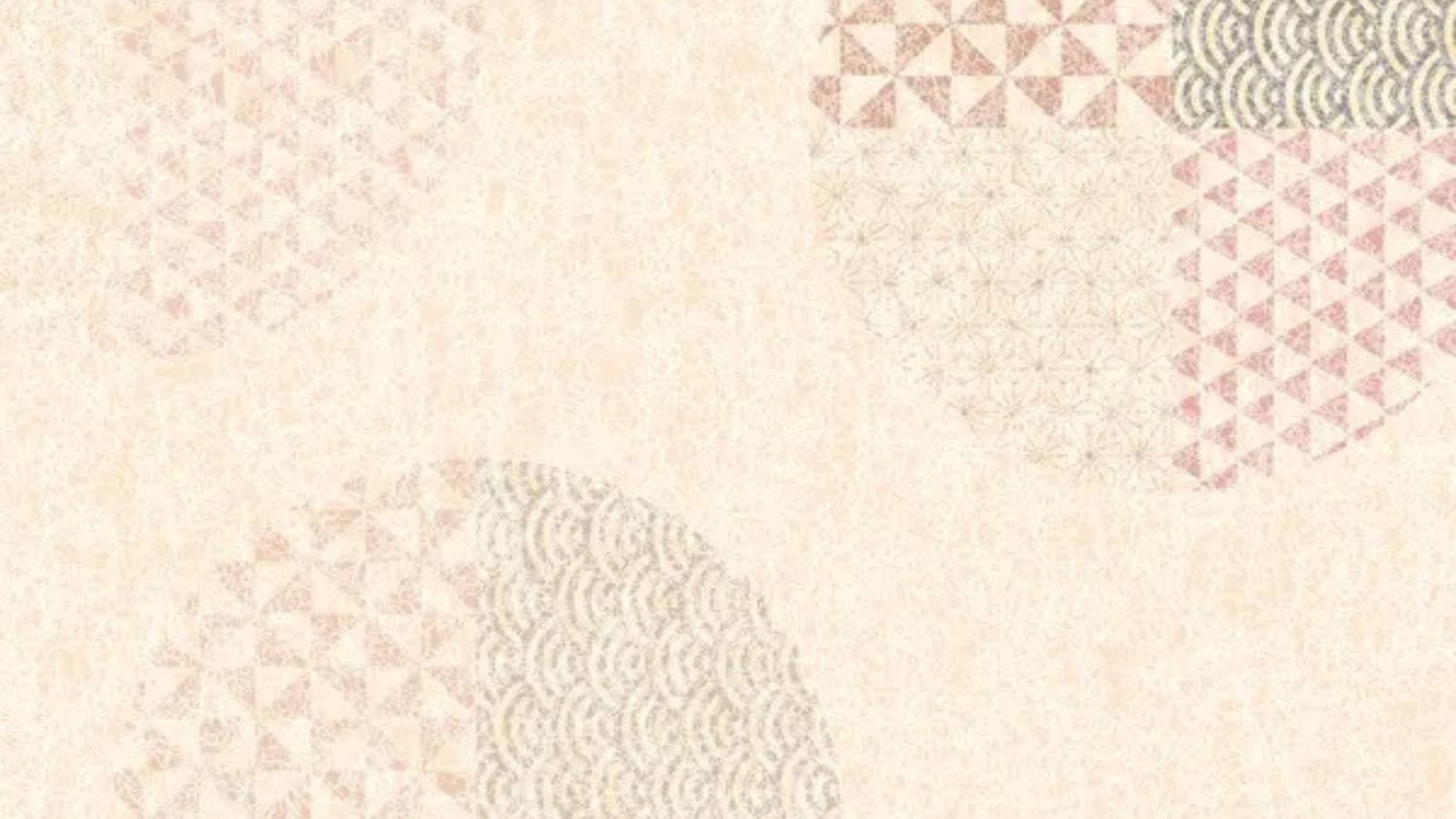
The Traditional Japanese Color Palette
The traditional palette is called dentōshoku (伝統色)—“colors of tradition.” These hues are softer, with a slight grayish undertone, evoking harmony and subtlety.
- Shuiro (朱色) – Vermilion red, seen at Shinto shrine gates (torii), symbolizing protection and vitality.
- Kurenai (紅) – Crimson red, associated with life force and celebration.
- Sakurairo (桜色) – Cherry blossom pink, representing transience and renewal.
- Mizuasagi (水浅葱) – Pale blue-green reminiscent of shallow water.
- Ai (藍) – Indigo, beloved in textiles like yukata and noren curtains, symbolizing stability and calm.
- Kikuchiba (黄朽葉) – Golden-brown evoking fallen autumn leaves.
- Byakugun (白群) – Soft, bluish white, airy, and serene.
- Rikyūcha (利休茶) – Muted tea-brown named after tea master Sen no Rikyū, reflecting wabi-cha aesthetics.
Symbolism and Meaning in Japanese Colors
In Japanese culture, color carries layered symbolism, influencing art, fashion, and spiritual practices:
- Red (Aka 赤) – Energy, happiness, and protection. Common in wedding kimonos and shrine ornaments.
- White (Shiro 白) – Purity and simplicity, but also mourning in some contexts.
- Black (Kuro 黒) – Associated with elegance, strength, and sometimes mystery.
- Green (Midori 緑) – Youth, vitality, and nature.
- Purple (Murasaki 紫) – Historically, a color of nobility and spirituality, rare and costly.
- Gold (Kin 金) – Wealth, divinity, and prestige, often seen in temples.
Even today, Japanese people choose colors to match seasons, moods, and occasions.

Applications in Art, Craft, and Daily Life
Traditional Japanese colors shape everything from fine art to everyday objects:
- Kimono and Textiles – Artisans hand-dye silk using natural pigments like safflower for reds, indigo for blues, and gardenia fruit for yellows.
- Ukiyo-e Prints and Painting – Woodblock artists used mineral pigments, creating soft but striking contrasts. Hokusai’s Great Wave introduced Prussian blue into Edo art.
- Architecture and Temples – Vermilion torii gates, the browns of Zen temples, and mossy greens in gardens embody a philosophy of blending with nature.
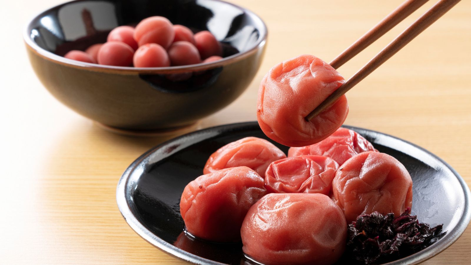
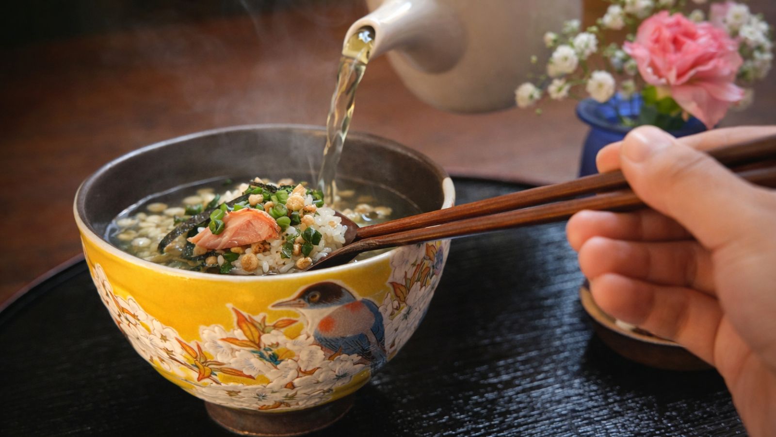
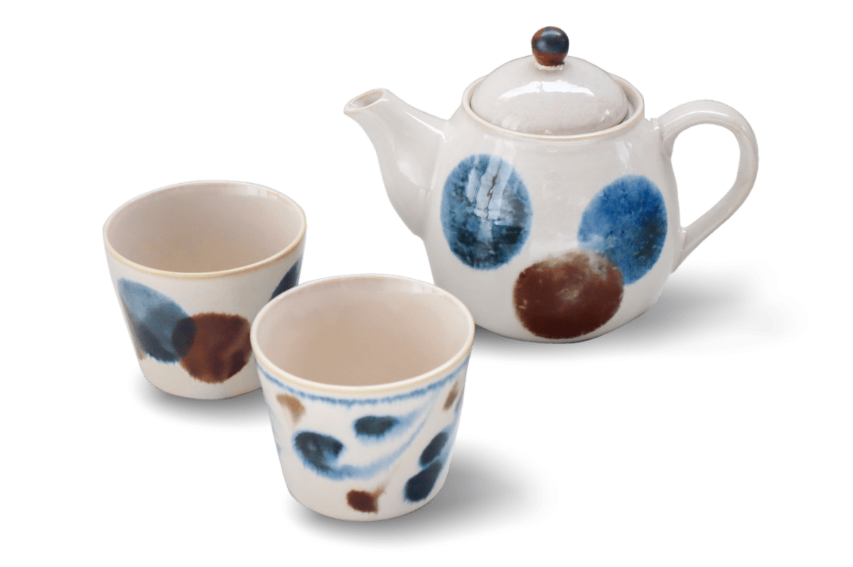
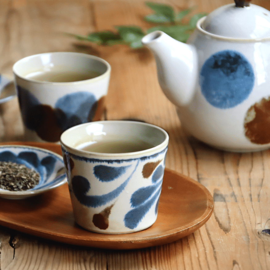
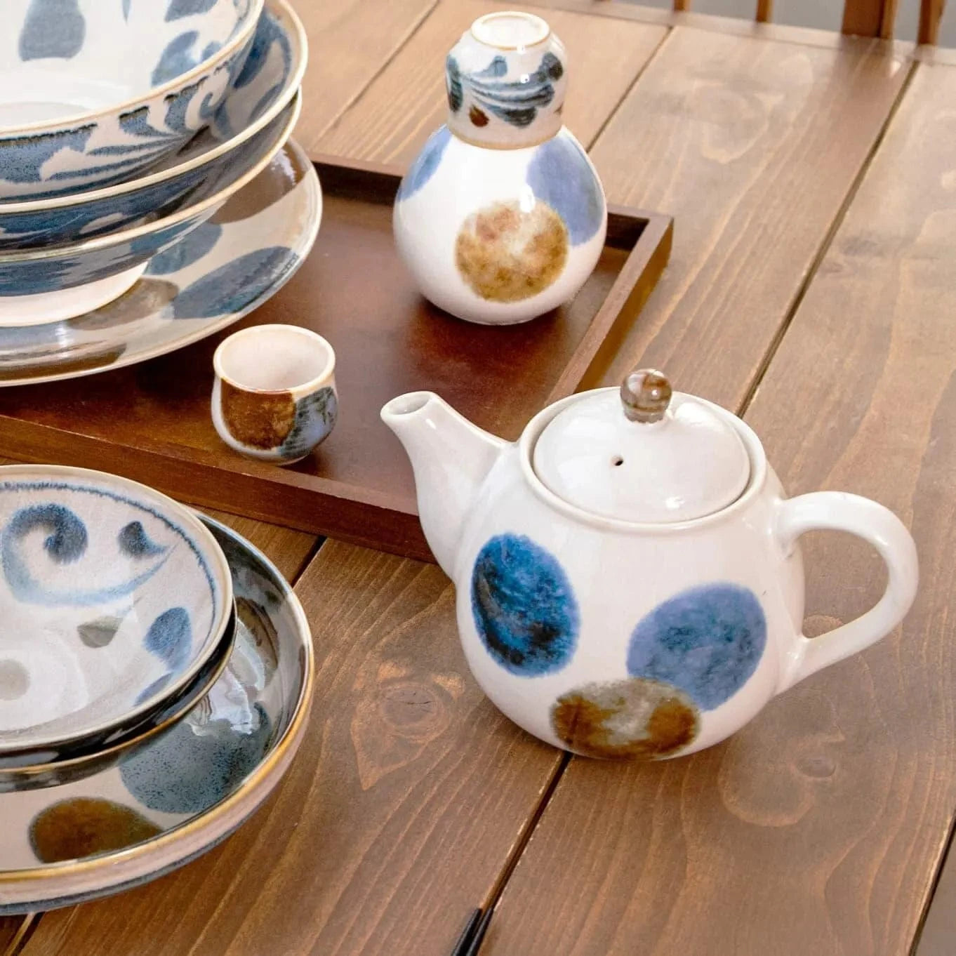
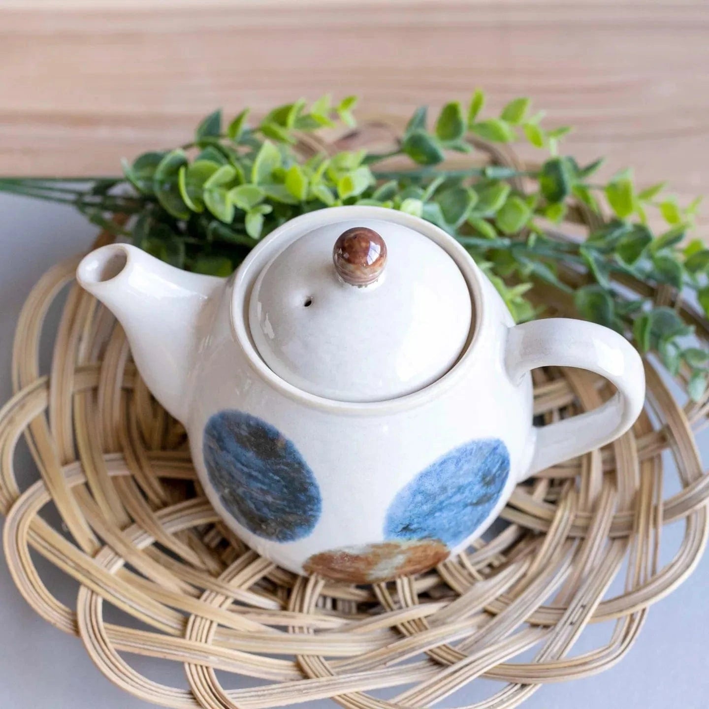
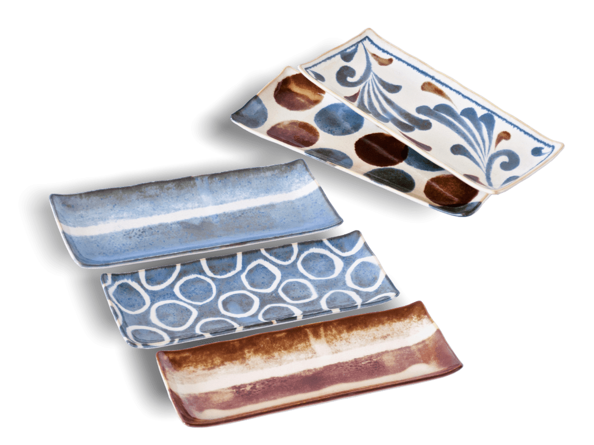
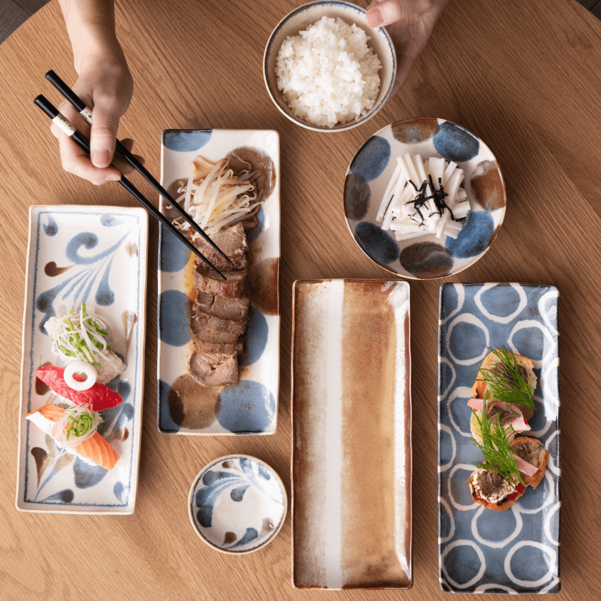
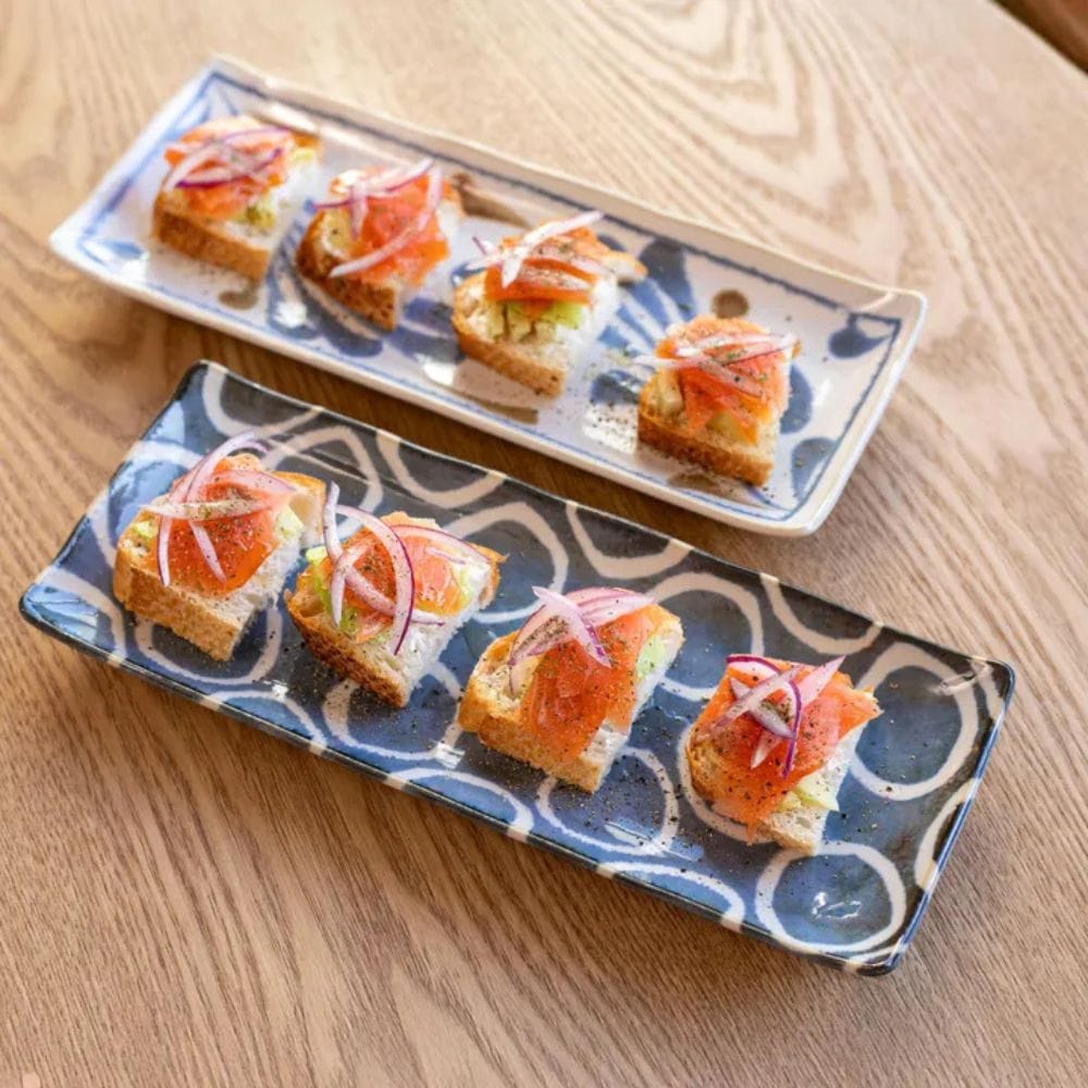
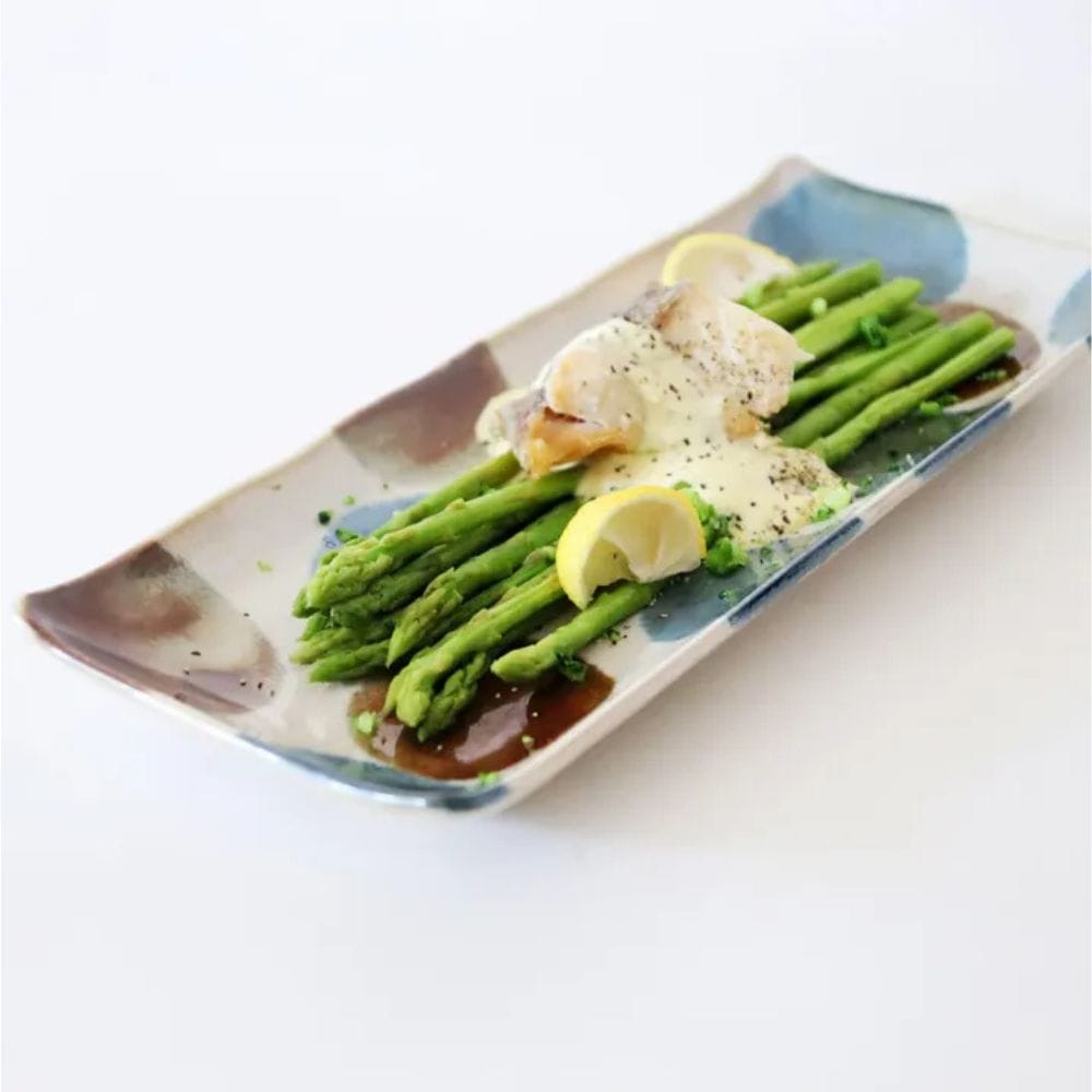
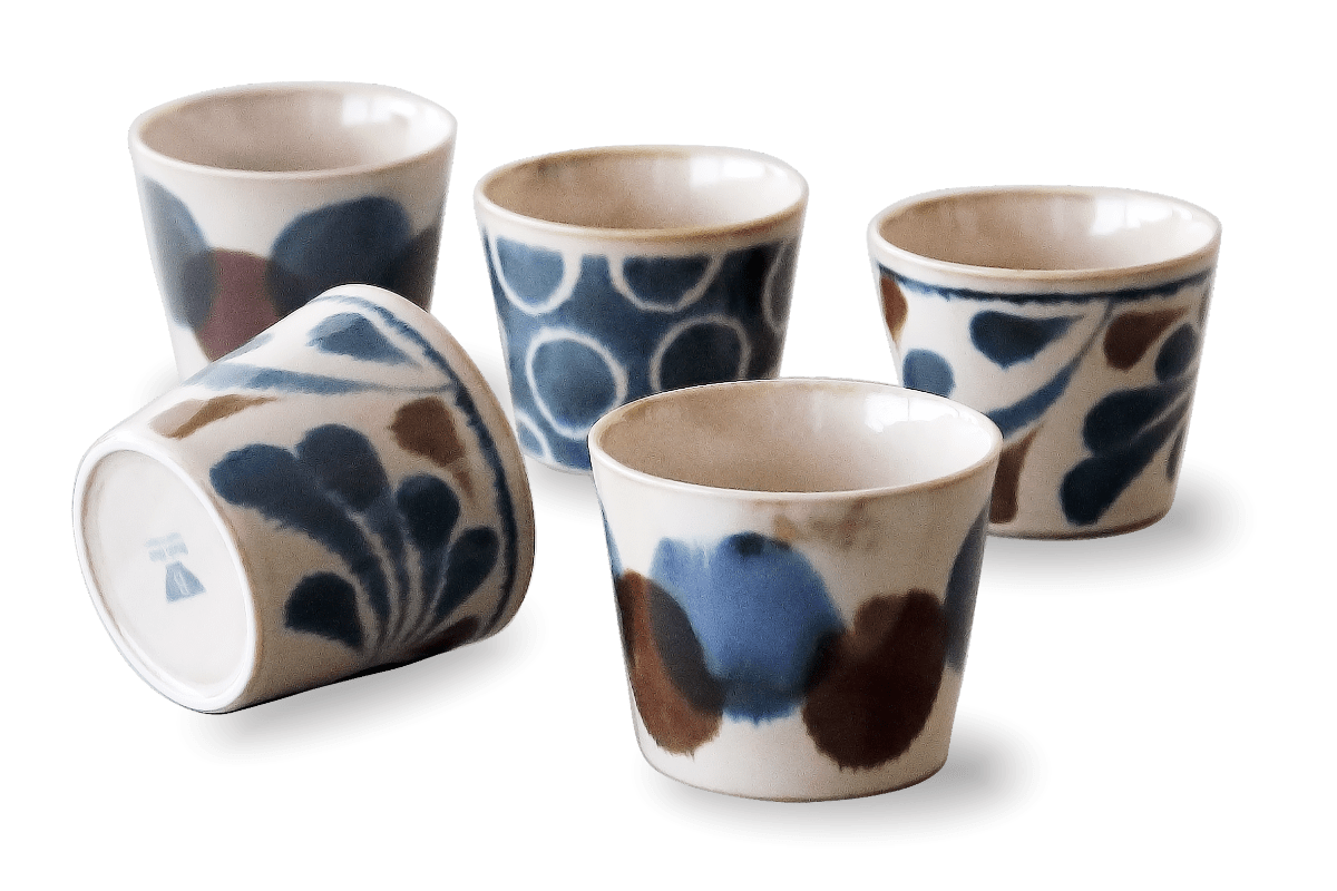
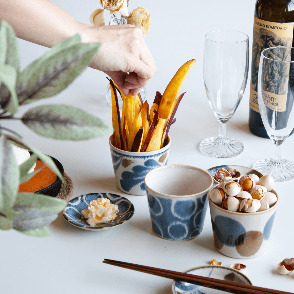
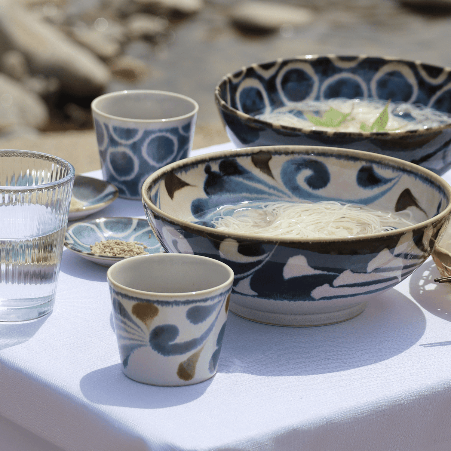
- Tableware and Tea Ceremony – The muted glaze of a Raku tea bowl or the earthy tones of a hand-thrown matcha chawan (抹茶茶碗) connect the drinker to nature’s palette. A lacquered tray in deep shu adds symbolic beauty to a meal.
In your own home, embrace this harmony by choosing authentic Japanese tableware in these traditional hues. A soft sakurairo cup for spring tea, a deep indigo sake set for autumn evenings, it’s a way of living with the seasons.

Practical Tips: Bringing Japanese Colors Into Your Life
- Start with Nature-Inspired Tones – Choose colors that reflect your favorite season: pink for spring, cool blues for summer, warm browns for autumn, and soft whites for winter.
- Mix Subtle and Bold Accents – Japanese aesthetics balance muted base colors with one striking hue. For example, a neutral table setting with a pop of vermilion in a serving bowl.
- Invest in Artisan Craftsmanship – A handcrafted ceramic cup in rikyūcha or a lacquerware tray in kurenai adds depth and story to your table.
- Learn the Names – Knowing words like sakurairo or ai makes you more aware of how colors convey emotions and evoke memories.
A Living Palette of Tradition
Japanese colors serve as a bridge between the past and the present, a living tradition evident in temples, paintings, and even the humble tea bowl. They are not just visual but emotional and seasonal, reminding us to find beauty in small details.
What color speaks to you today?


Share: